The Ugly Text Minimal White Screen Ad Format
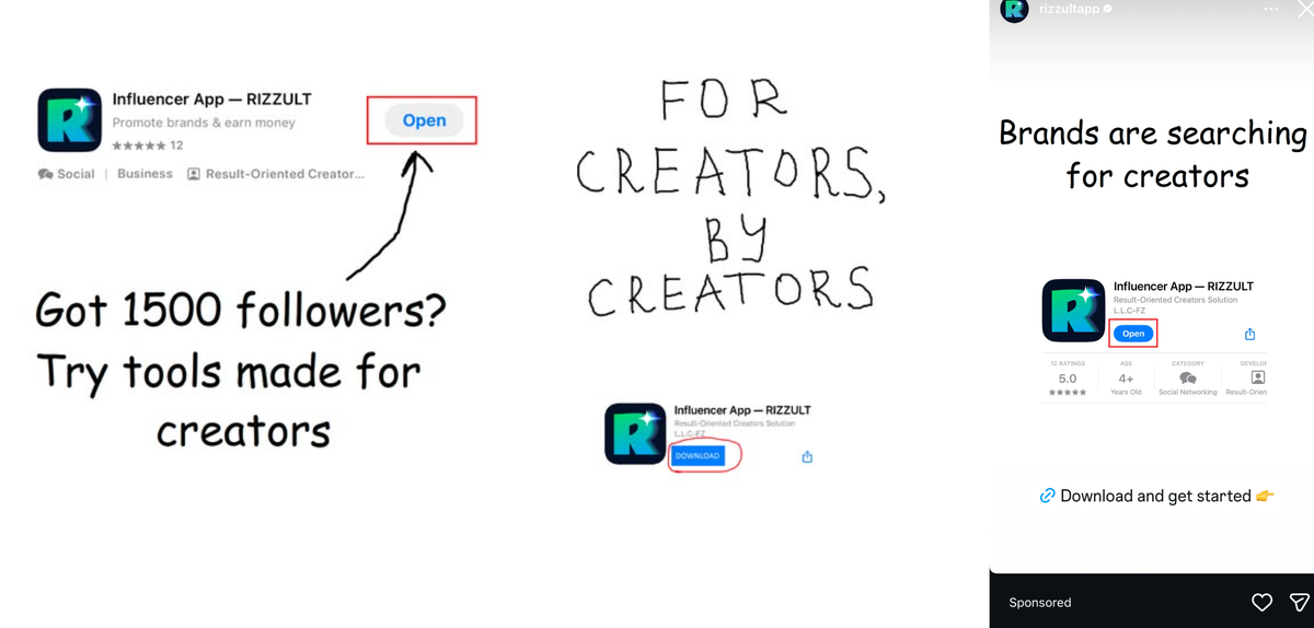
Some advertisers rely on complex visuals, influencers, fast edits, or animated graphics. Rizzult has gone in the opposite direction. Their entire campaign uses nothing more than:
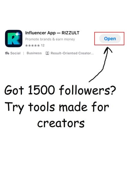
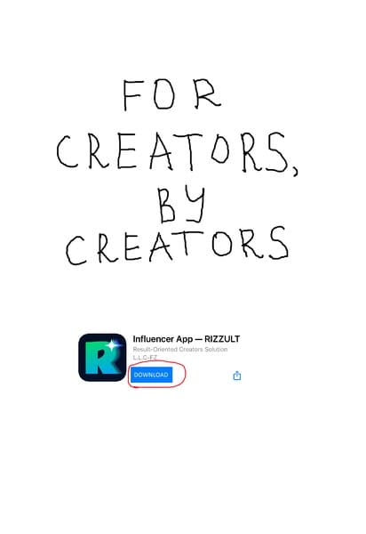
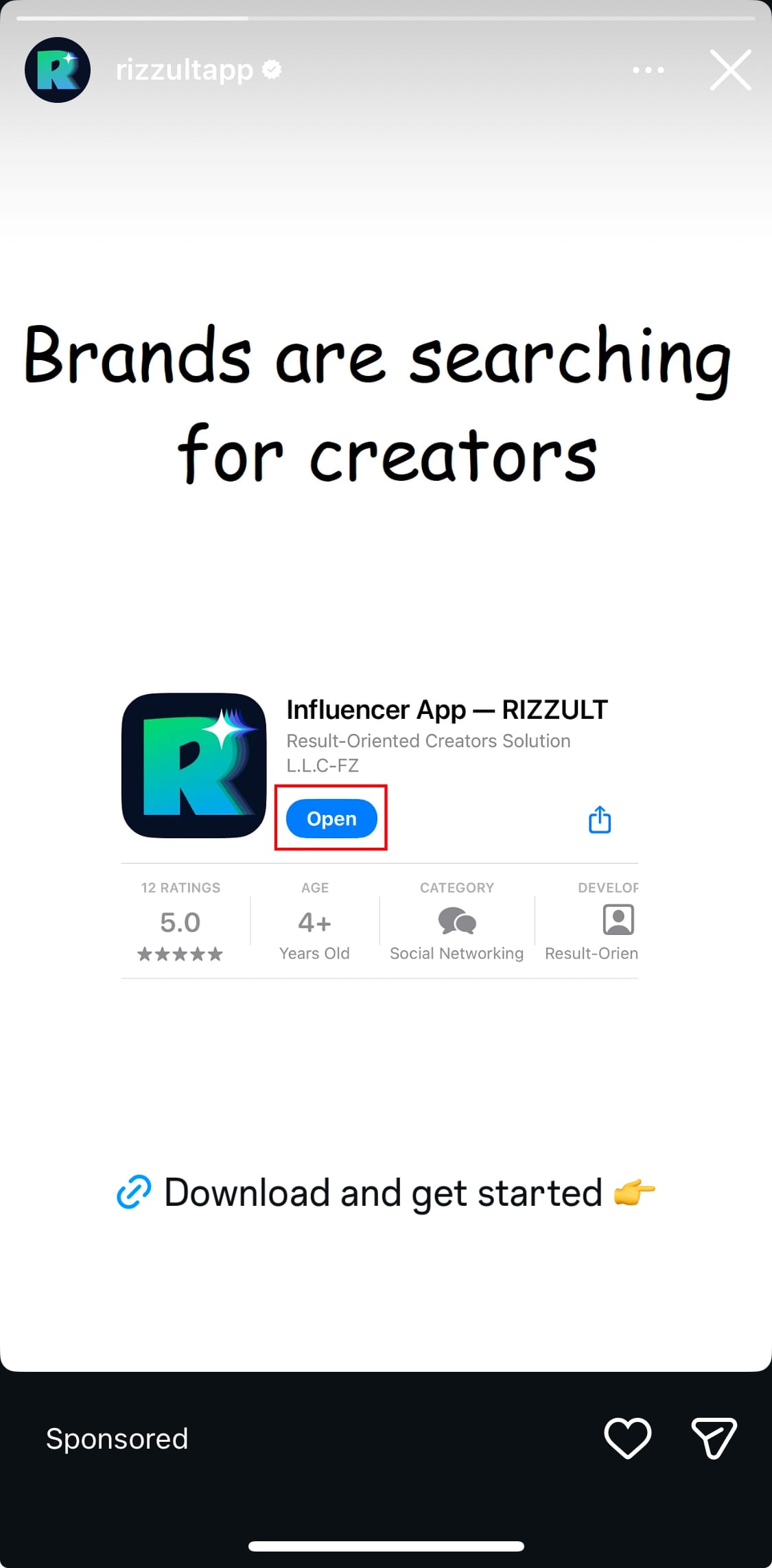
- A white screen
- A simple handwritten font
- A single line of copy
- An App Store card screenshot
- A small highlight on the “Download” or “Open” button
Despite looking almost unfinished, these ads are extremely intentional. They break the pattern of what Instagram Story ads usually look like, and that is why they work.
Here are the three variations currently running:
- For creators, by creators
- Got 1500 followers? Try tools made for creators
- Brands are searching for creators
All of them follow the same clean structure. All of them are built on the same insight.
Why This Ad Format Works So Well
1. The ads look like notes, not ads
Stories are full of hand written fonts, doodles, screenshots, and rough text. By matching that style, these ads feel native to the platform.
People skip anything that feels overly produced. These ads win by being deliberately underproduced.
2. The white background resets attention
Instagram Stories are loud. Colorful. Busy. Fast.
A plain white screen acts like visual silence. It resets your brain, giving the message extra weight. Pattern breaking through simplicity is one of the oldest tricks in advertising.
3. The headline solves a creator’s immediate desire
Each line speaks directly to what creators want most:
- Being taken seriously
- Growing enough followers to earn money
- Getting attention from brands
The ad does not try to educate. It taps into a pre existing motivation.
4. The App Store card handles the credibility
Most ads spend time trying to prove they are real.
This ad format lets Apple do the proving. By showing the official App Store listing, the viewer instantly sees:
- The rating
- That it is live
- That it is legitimate
- That other people already use it
The highlighted “Download” or “Open” button becomes an easy, low friction action.
5. The message is absorbed in one second
There is no learning curve. No story to watch. No transitions. No distractions.
You read the line.
You see the app.
You click.
Minimal cognitive load equals higher conversion.
6. The campaign feels consistent
By repeating the same structure across multiple ads, viewers start to recognise the style. This builds familiarity, which is one of the strongest predictors of ad effectiveness.
Even if they skip one variation, they will understand the next instantly.
Why This Format Is Especially Good for Creator Apps
Creator tools are often overwhelming. New dashboards. New terms. New processes. But these ads do not try to explain the product. They focus only on the value:
- You want brand deals
- You want to grow
- You want better tools
- Here is the app
- Download it
The simplicity becomes the positioning.
The ad does not shout.
It quietly promises momentum.
Lessons for Other Advertisers
This campaign shows that:
1. Not every ad needs a full design.
Sometimes a white screen is the smartest creative in the room.
2. Ads that look like everyday content outperform ads that look like ads.
3. Repeating a simple format across variations creates recall.
4. The App Store card is a powerful asset that most brands underuse.
5. The right message matters more than the right visuals.
Final Thought
The Rizzult campaign is a perfect example of how low effort design can deliver high impact results. In a crowded creator economy where every brand is shouting, these ads whisper.
They are clean, direct, and laser focused on what creators care about.
This is modern minimalism as a performance strategy.