The Ugly Ad Format
Why Terrible Ads Grab Attention and Sometimes Outperform Polished Ones
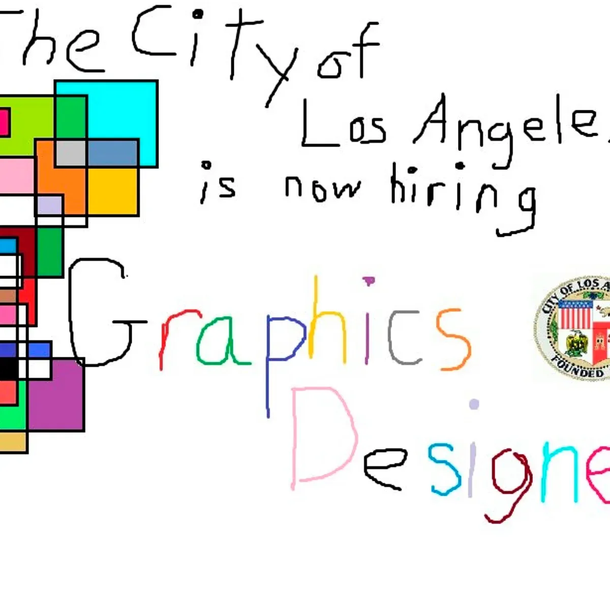
There is a strange truth in advertising that keeps proving itself over and over. Ugly ads work. They work for memes, they work for awareness, and they definitely work when companies pretend to be helpless in order to hire a graphic designer.
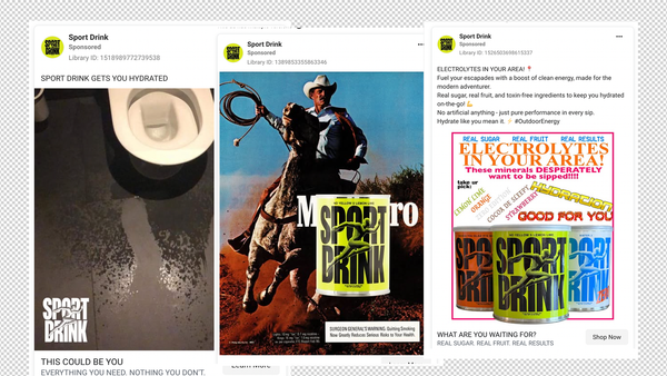
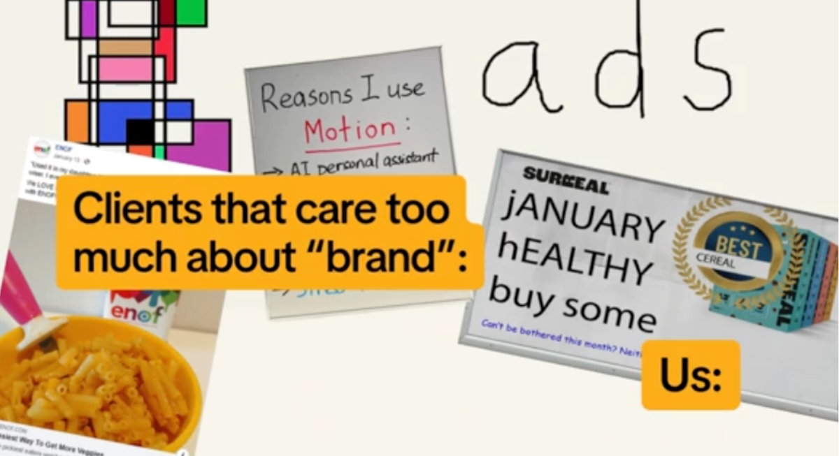
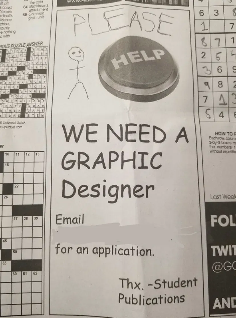
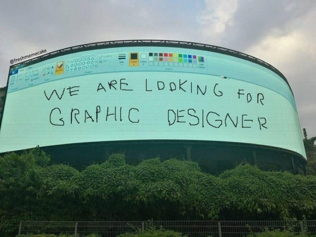
The examples above show it perfectly. MS Paint text that looks like it was written with a broken mouse. Rainbow gradients from the early internet. Stick figures crying for help. Ads so bad they almost feel like performance art.
But here is the important part.
Ugly ads do not only work because the target audience is graphic designers.
They work because ugly ads grab attention across any market.


Why Ugly Ads Work
1. They break the pattern
Most ads are polished. When something looks wrong, cheap, rushed, or chaotic, it stands out in the scroll. Your brain stops because your expectations are broken.
2. They feel more human
People trust things that look unpolished. Ugly ads feel like someone made them quickly, in real life, on a real computer. That rawness feels honest.
3. They create curiosity
If an ad looks bad, you lean in to figure out what is going on. That extra second of attention is more valuable than a perfect layout.
4. The humour carries the message
A terrible design calling out for a designer is inherently funny. But that same humour works in non designer campaigns too. The joke becomes the hook.
5. They are highly shareable
This format naturally spreads across social platforms because people enjoy showing their friends things that look hilariously terrible.
@rightleftagency Branding folks are gonna hate this take BUT... ugly ads work for B2B. For one simple reason: ⤷ They don’t look like ads. Let's face it— we're pretty desensitized to traditional high-production value digital ads. (Heavily branded, inauthentic, obvious, basically— boring.) But so-called "ugly ads" have been having their moment—and we’re not talking about “accidental bad design” or "unreadable text" here. Ugly ads ≠ bad ads. We mean something that looks imperfect enough that it HAS to be organic. Blends in with the fees. Draws your attention. Converts like crazy. 💥 Why it works: 👉 Pattern break = scroll stopper 👉 Feels raw + real (hello, trust factor) 👉 Shows your brand’s confident enough to not take itself TOO seriously 👉 Memorable for all the right reasons Trust us— the brands that are brave enough to stray from their usual are the brands that reap the rewards. So, should you fire your creative team and boot up MS Paint? Not quite. BUT if your polished campaigns are flopping, maybe it’s time to ugly things up... on purpose. 🎨👀 Looking to make ugly ads that actually work? Send us a DM! #uglyads #b2b #b2bmarketing #digitalmarketing #digitialmarketingtips #creative #creativestrategy #adcreative #marketingagency #onlineadvertising #onlineads #instagramtips #marketingoninstagram #instagrammarketingtips #socialmediamarketing #growthstrategy #creativecontentmarketing #graphicdesign #design #graphicdesign #RightLeftAgency
♬ original sound - Right Left Agency
Ugly Ads Can Work for Any Audience
Even though many of the examples are about hiring designers, the principle goes far beyond that.
Low quality design can work for:
- Food delivery
- Local services
- Events
- Real estate
- Tech products
- Retail offers
- B2B campaigns
- Social proof ads
- Re engagement ads
As long as the ugliness is intentional and tied to a simple message, the ad can outperform a polished content piece. Sometimes it is the low effort look that makes it feel authentic.
This is the same reason why plain text screenshot ads, notes app ads, and quickly sketched graphics keep going viral. People are tired of ads that look like ads.
How to Use Ugly Intentionally
1. Strip out all polish
Use basic fonts, bad spacing, and odd colours.
2. Make it look like someone did it in 30 seconds
The joke or message should feel accidental even though it is strategic.
3. Keep the message brutally clear
No fluff. No paragraphs. One point.
4. Add a little humour
It increases engagement and makes people want to share it.
5. Do not oversell the joke
Ugly ads work when they are simple. The moment you try too hard, the effect is lost.
Final Thought
Ugly designer hiring ads are funny, but the lesson behind them is much bigger. In a world full of perfect templates and AI clean visuals, the easiest way to capture attention is sometimes to do the opposite.
Imperfection stands out.
Imperfection feels human.
Imperfection gets clicks.
Ugly works, even when it should not.