The Apple Notes Ad Format
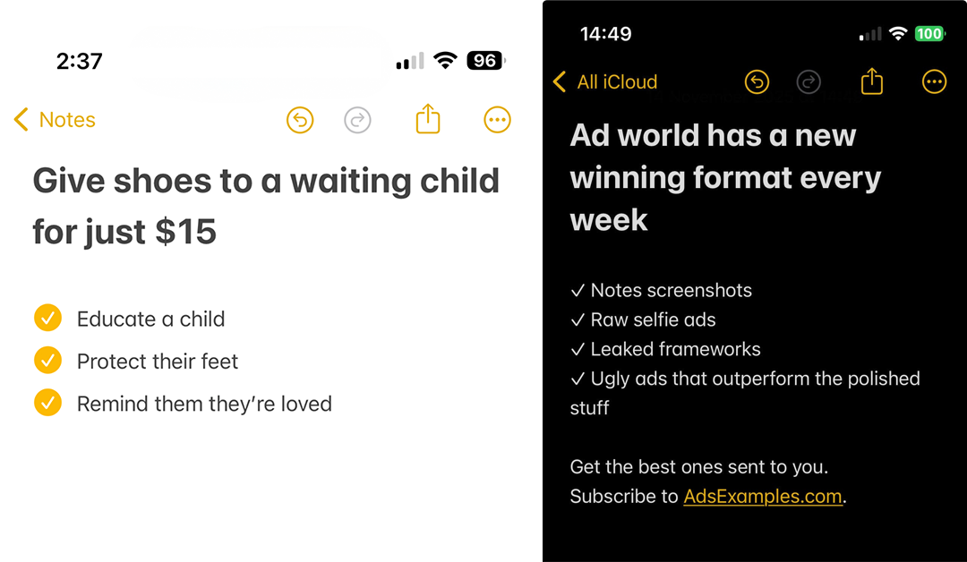
A simple screenshot format that keeps outperforming polished creatives
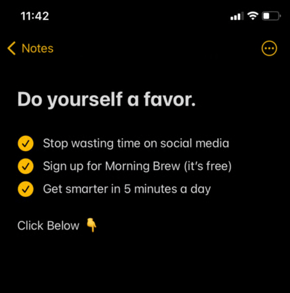
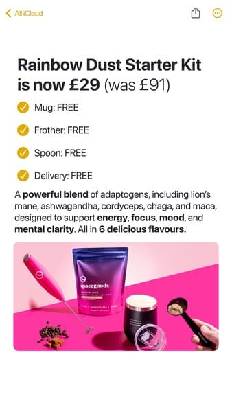
Some of the highest performing ads on social right now are not videos, not polished graphics, and not even designed. They are screenshots of the Apple Notes app.
This format has been around for a while, but it has exploded again because creators on X, TikTok, and IG are rediscovering how effective it is. The psychology behind it is simple. Apple Notes feels personal, unfiltered, and close to how real people take notes. When you turn that into an ad, it slips past ad blindness instantly.
You can make these inside Apple Notes and take a screenshot, or you can use generators like orshot.com to recreate the layout perfectly.

Why Apple Notes Ads Work
1. They do not look like ads
This is the biggest reason these win. A Notes screenshot looks like something you wrote for yourself. People do not scroll past it the way they scroll past polished graphics.
2. It feels honest and direct
The Notes aesthetic gives the message a sense of simplicity and truth. Viewers assume you wrote the list yourself. It feels like advice, not a CTA.
3. It is clear and readable
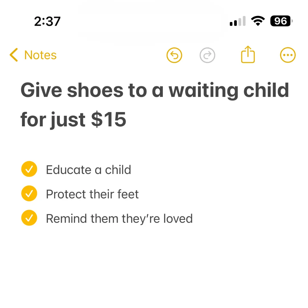
One bold headline, a short checklist, and a single call to action. No clutter. No distractions.
4. It plays into the “ugly ads win” rule
People trust low friction, low design content more than overproduced visuals. A Notes screenshot looks rough and authentic, which creates attention.
5. It is extremely fast to produce
You can create one in under two minutes. The format is built around speed. This makes it perfect for fast testing, rapid iteration, and creative fatigue recovery.
6. It works in every niche
Charity
Supplements
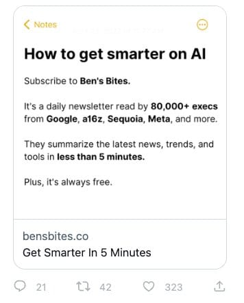
AI tools
Newsletters
Courses
Ecom
Coaches
Apps
If you can write a list, you can make this format work.
The Core Structure
Every Apple Notes ad follows the same simple layout:
- A bold headline that delivers the benefit
- A short list of outcomes or promises
- A screenshot style that feels native to iOS
- Optional product image on the right
- Optional arrow or CTA at the bottom
That is it. The minimalism is the creative.
Why Brands Love This Format
- It is almost impossible to mess up
- It adapts well to static placements
- It is a perfect retargeting format
- It looks organic, not paid
- It can carry emotional messages without feeling corny
Even big brands use it because the trust signal is so strong.
How to Make Your Own
1. Open Apple Notes
Write the headline, bullet points, and CTA.
2. Screenshot it
Crop it cleanly.
3. Or use a template generator
https://orshot.com/templates/iphone-notes-screenshot/generate
This gives you a perfect Notes aesthetic without having to use your phone.
4. Upload as a static creative
It works best in feeds, story placements, and spark-like formats.
Why This Format Is Still Growing
In a world full of AI generated visuals, Notes screenshots feel refreshingly human.
They signal that someone typed something out, thought about it, and wanted to share it. That human energy cuts through better than any gradient, animation, or cinematic shot.
Apple Notes ads are one of the simplest formats you can test, and one of the fastest ways to create direct response messages that people actually read.

