Sport Drink’s Ads: Anti-UX, Anti-Funnels, Pro-Attention
At first glance, Sport Drink’s ads look almost broken.
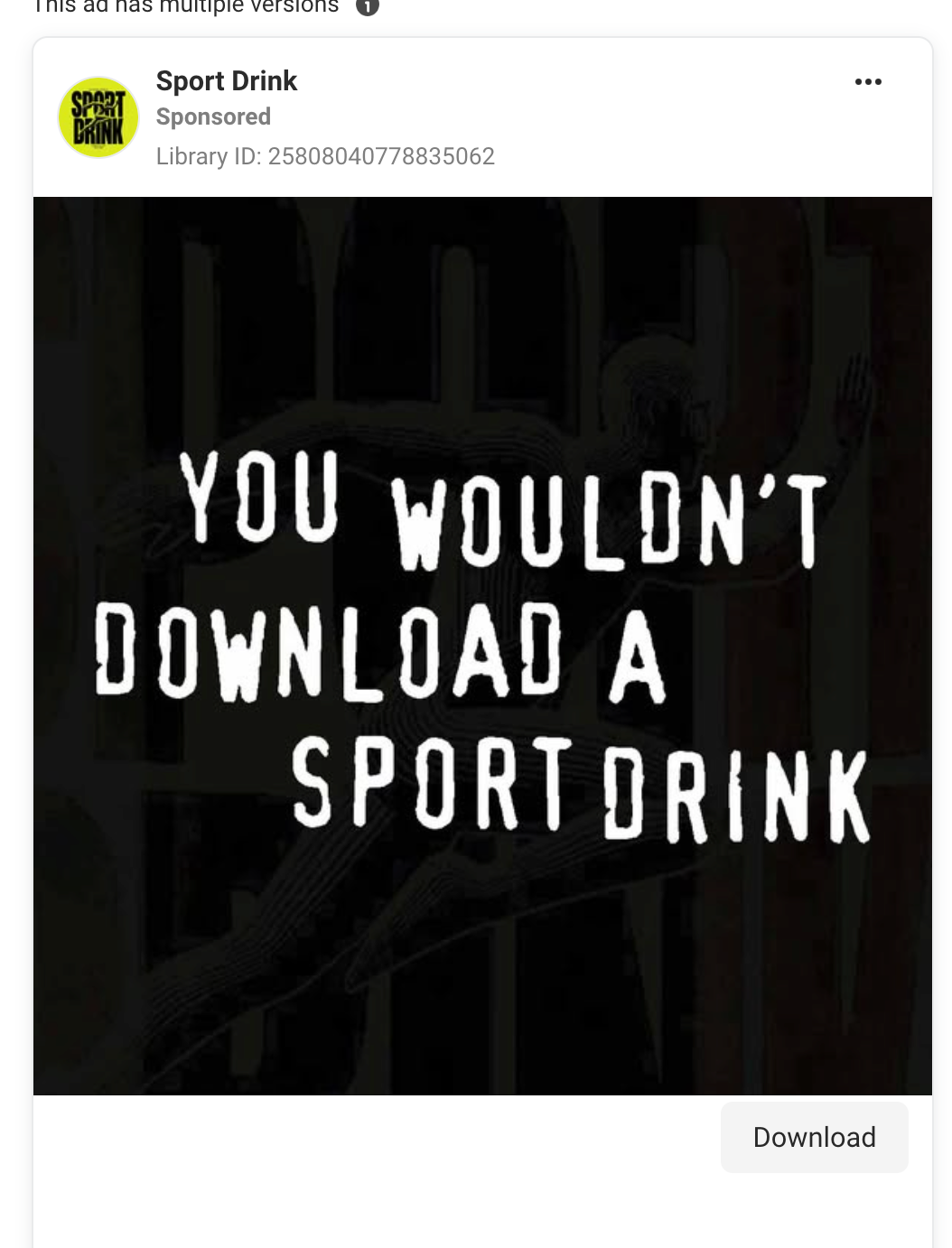
Instead of typical ads or content, you get black screens, blunt statements, and deliberately uncomfortable copy like:
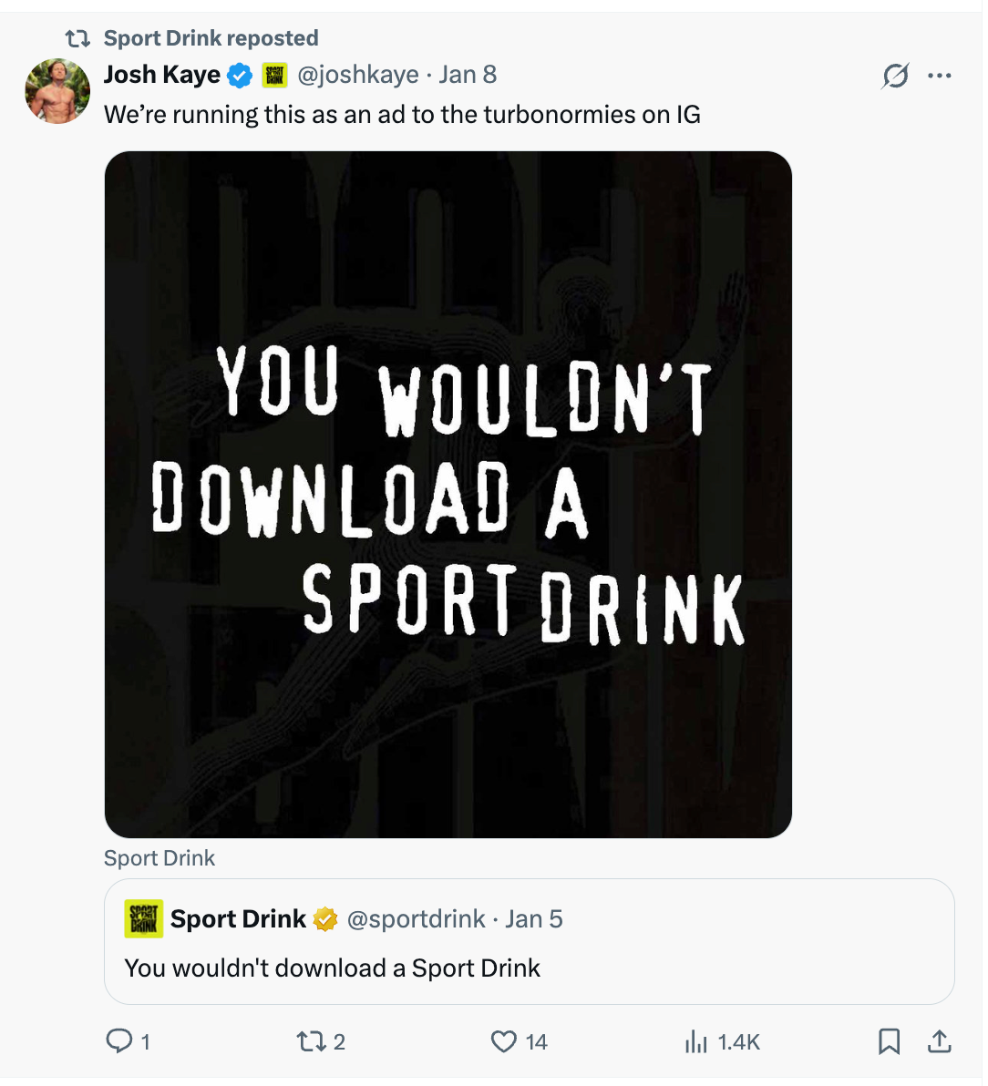
“YOU WOULDN’T DOWNLOAD A SPORT DRINK.”
And that is the point.
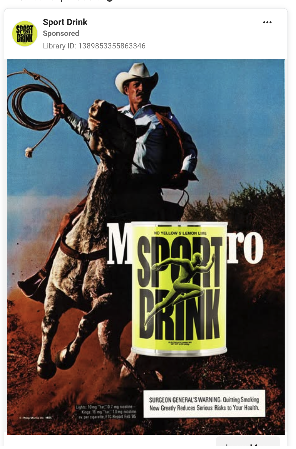
1. Borrowing Internet Culture on Purpose
This line is a direct callback to early-2000s anti-piracy campaigns. The ones that said you wouldn’t steal a car. Sport Drink repurposes that cultural memory and applies it to something mundane and physical.
It works because it triggers recognition first, curiosity second, and brand recall third.
This is meme logic, not performance logic.
The ad does not explain the product.
It does not pitch hydration.
It does not even show the drink clearly.
It simply makes your brain pause.
That pause is the win.


2. Anti-Optimised by Design
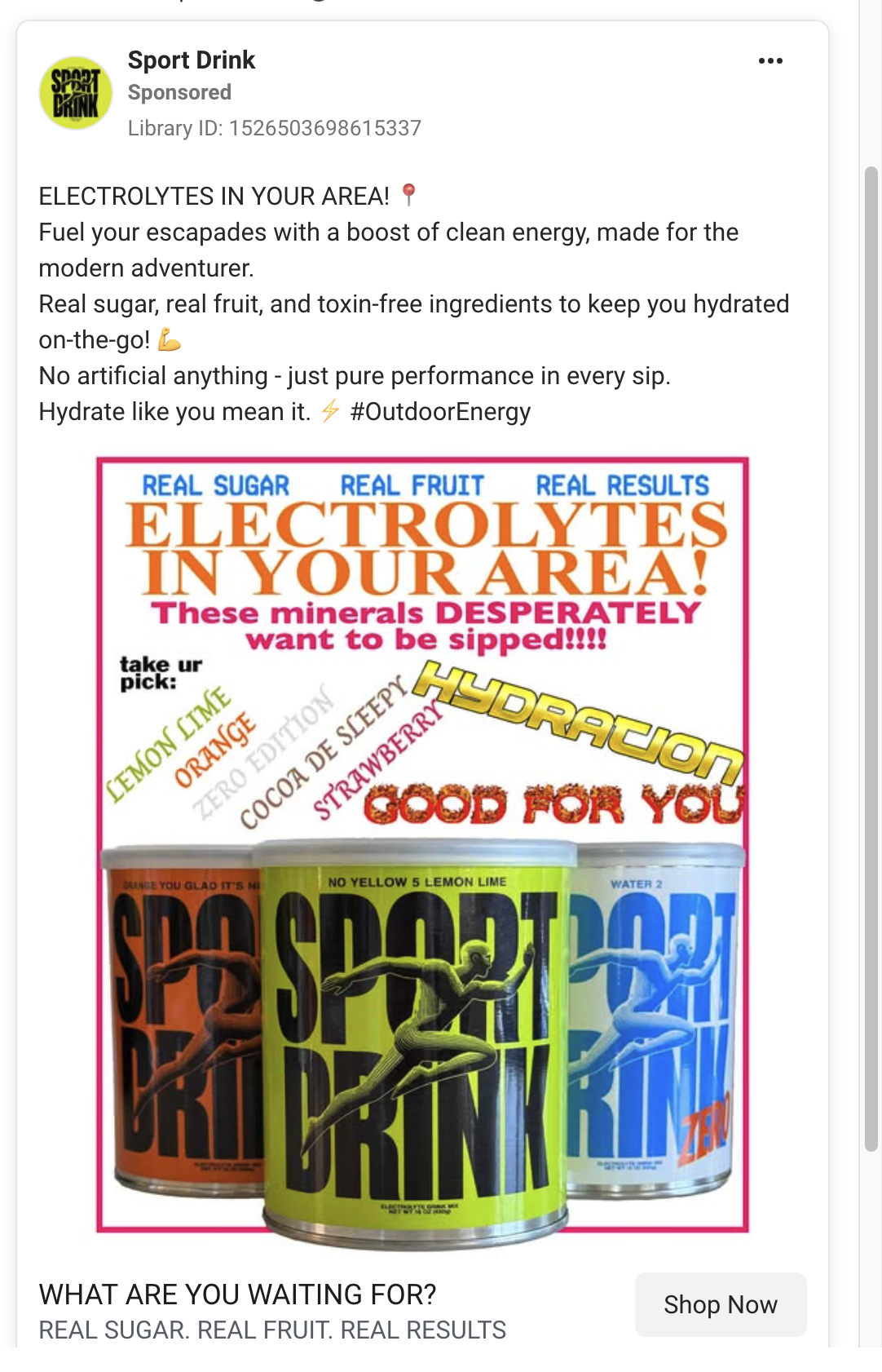
Look at the rest of the Meta library and a pattern emerges:
- Static images with blunt text
- Low-production video
- Minimal motion
- Repeated slogans
- Almost no traditional CTA language
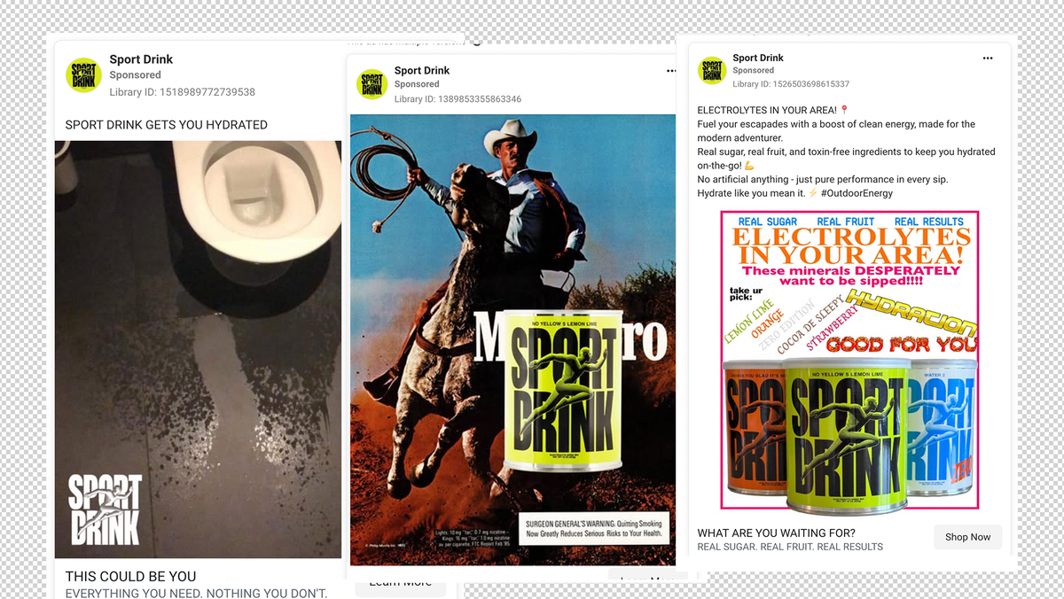
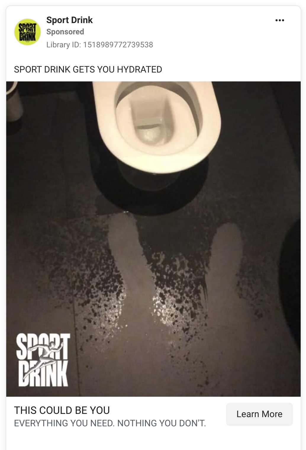
Some ads are literally just the product sitting there with a sentence like:
“This could be everything you need and nothing you don’t.”
That is an intentional rejection of modern conversion theory.
They are not trying to compress meaning into three seconds.
They are stretching meaning over repetition.
When someone sees five or six Sport Drink ads over time, the brand becomes familiar without ever begging for attention.

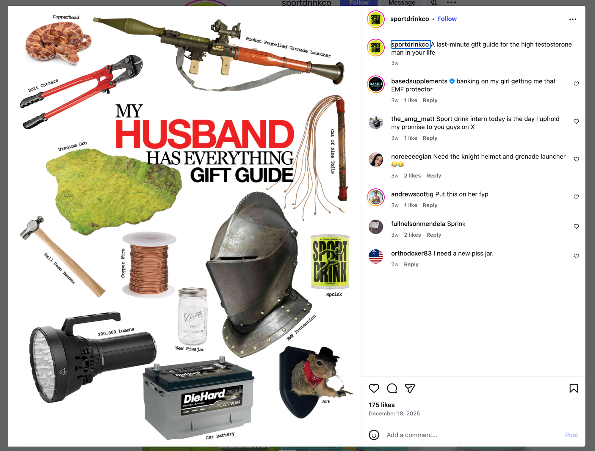
3. The Website Matches the Ads Exactly
This is where the strategy really locks in.
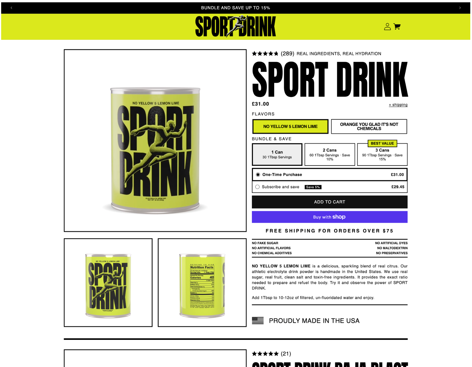
The homepage feels like a printed zine or an early internet storefront:
- Stark layouts
- Bold typography
- Minimal explanations
- Products named like inside jokes
- A literal spoon sold as merch
Nothing about the site tries to reassure you in a traditional ecommerce way.
That alignment matters.
If the ads were weird but the site was polished and corporate, the spell would break. Instead, the brand commits fully. The ads feel like fragments of the website. The website feels like a longer version of the ads.
That consistency builds trust with a very specific audience.
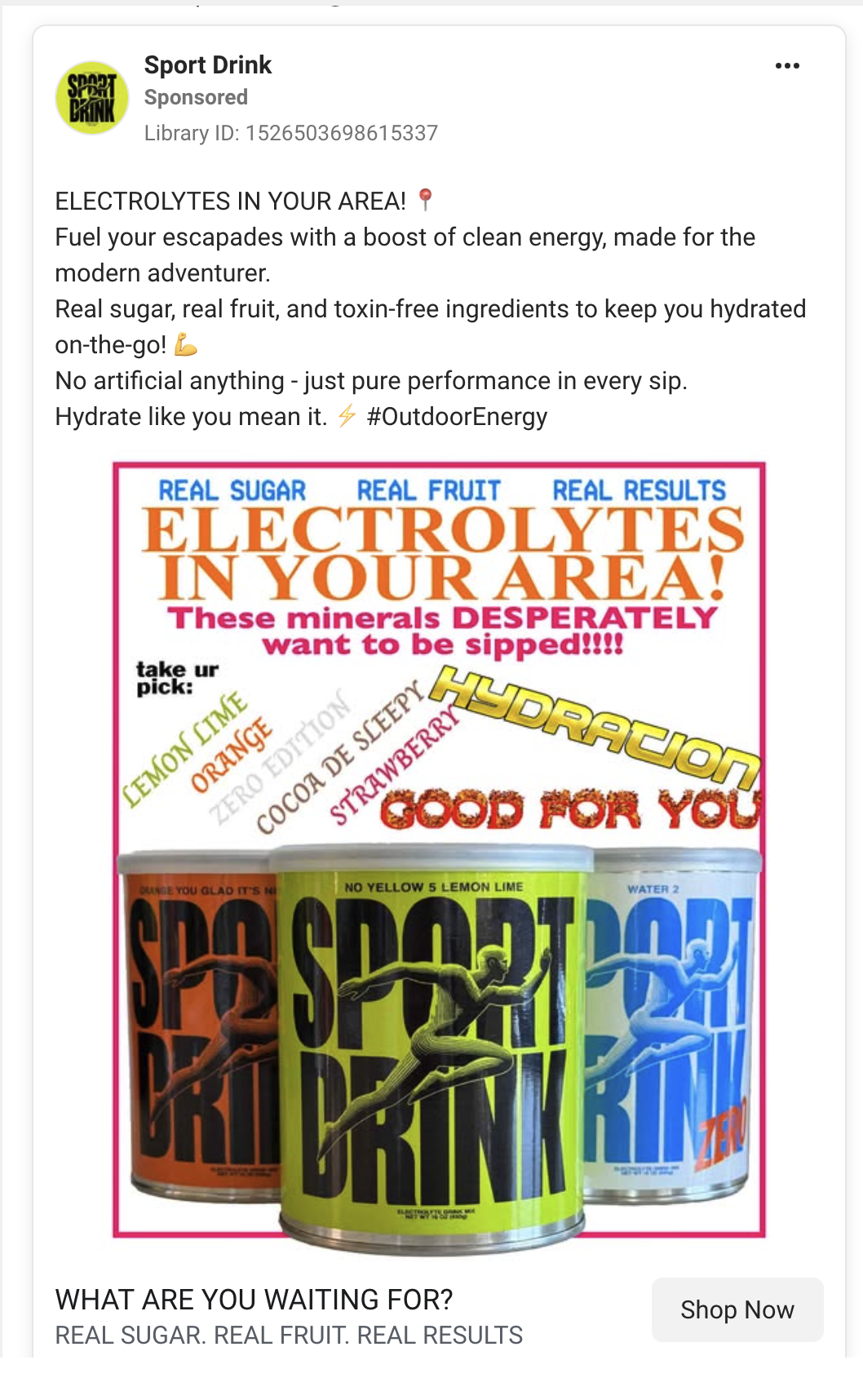
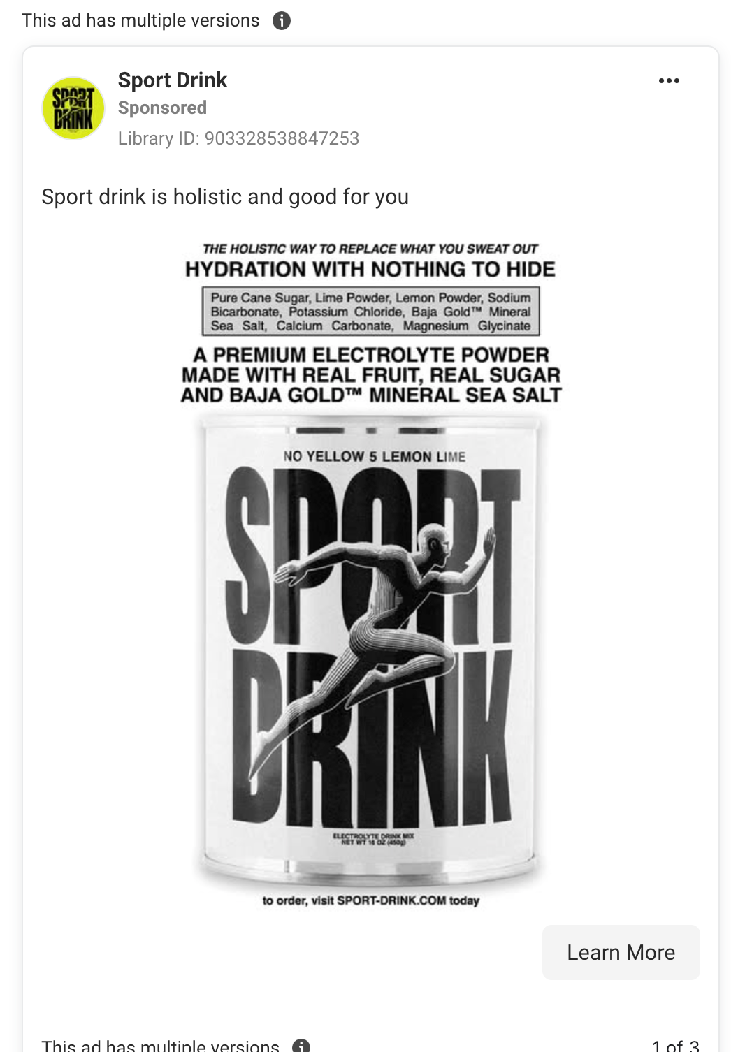
4. Selling Identity, Not Electrolytes
Sport Drink is not competing with Gatorade on hydration science.
They are competing on taste, aesthetics, and cultural alignment.
These ads are saying:
- I do not like fake ingredients
- I do not like fake marketing
- I do not like being sold to aggressively
- I like things that feel slightly underground
You either get it instantly or you do not. And that is intentional.
Polarisation is doing the targeting.

5. Why This Works on Meta Right Now
Meta ads are saturated with the same formats:
- Creator talking to camera
- Big captions
- Fast edits
- Manufactured authenticity
Sport Drink cuts through by doing the opposite.
Their ads feel more like album covers than sales creatives. That makes them feel optional, which paradoxically makes people engage with them more.
People do not feel chased.
They feel invited.
The Takeaway for Advertisers
Sport Drink is a reminder that performance does not always mean optimisation
Sometimes the strongest ads:
- Do not explain
- Do not rush
- Do not convert immediately
- Do not care if everyone likes them
They care about being remembered.