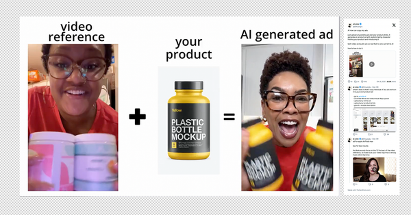
How Spacegoods Build High Performing Ads and How You Can Too
Spacegoods have become one of the most consistently interesting advertisers in the wellness space.
Not because they use wild concepts or heavy production, but because they build clear, modular creative that isolates one emotion, one problem, or one benefit at a time.
Their library shows how a single product can be framed in dozens of different ways, each one targeting a specific trigger.
Below is a breakdown of the core angles they use most often, why these approaches tend to perform, and what other brands can take from the way they structure their creative.
It is not every ad they run, and their library shifts fast, but these examples show the patterns that consistently drive results.
Science Backed Benefits Angle
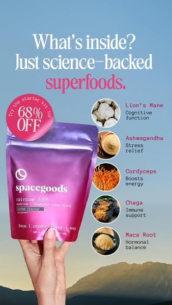
This is a textbook example of the science backed benefits angle that lots of wellness brands use. The product sits at the bottom, but the real hook is the quick list of ingredients paired with simple, one word benefits. Cognitive function. Stress relief. Energy. Immune support. Hormonal balance. It gives the viewer instant clarity with almost no thinking required.
The layout supports fast scanning. A curiosity headline at the top. A benefits list down the side. A strong offer badge. Then the product held in hand so it feels real. You can swap the brand out and this still works because the structure is doing the heavy lifting.
This angle performs well because:
- It removes guesswork.
- It gives viewers a reason to care.
- It creates perceived value by linking each ingredient to a benefit.
- It keeps everything simple and visual.
Spacegoods just happen to execute it cleanly here, but the angle itself is universal. If you want to show what your product does in three seconds, this format is one of the safest plays in supplements and functional drinks.
The Plain Text Story Angle

This is the simplest format in their playbook. No visuals, no product shots, just a note style message written like a personal update. It looks like an email dropped directly into a feed.
Why this angle works:
- Pattern breakMost supplement ads are loud, bright, and full of claims. A plain white screen with text feels like something you should read. It slows the scroll.
- Warm, human toneThe copy opens with “You asked for it, we delivered” which feels conversational. It mimics how a founder might speak to subscribers.
- Clear offerThe deal is front loaded. Fifteen percent off your next three months and three free gifts. The value is spelled out without clutter.
- Identity and ritualThey position the product as a ritual rather than a supplement. This is a strong shift because it creates lifestyle framing. People buy identity first and function second.
- Soft science supportIngredients are mentioned briefly. Just enough functional references to feel legit without turning into a science lecture.
- UrgencySale ends soon. Early stock pressure. Simple, believable urgency that fits the tone.
What this creative teaches:
Sometimes stripping everything back increases trust. When every brand is shouting with graphics, high saturation colors, and exploding benefits, the quiet note can cut deeper. This is a good example of how a pure copy ad can outperform design heavy formats simply by feeling personal and direct.
Use this angle when you want the message to feel like a one to one communication from brand to customer.
The Savings Stacking Angle
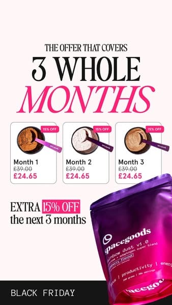
This ad leans fully into cost savings. No lifestyle story, no ingredient focus, just value. It is almost certainly built for remarketing where the viewer already knows what the product is. The only job here is to close the sale.
Why this angle works:
- Clear financial framing“The offer that covers 3 whole months” grabs attention by anchoring the length of value. It makes the saving feel big before the viewer even sees numbers.
- Side by side month breakdownShowing Month 1, Month 2, Month 3 with crossed out prices and new lower prices is a classic psychological play. It makes the saving feel repeated three times rather than a single discount. It exaggerates the sense of gain.
- Extra offer stacked on topAfter showing the three discounted months, the ad adds “Extra 15 percent off the next 3 months.” It is structured like a bonus on a bonus. This is perfect for people sitting on the fence.
- Minimal distractionsThe focus is the deal. The product shot is pushed to the side. No lifestyle imagery. No ingredient talk. This tells you exactly who this ad is for: warm audiences, abandoned carts, product page visitors.
- High contrast sale graphicsBright red price slashes and pink sale badges add urgency. This is Black Friday coded without needing to say much.
What this creative teaches:
When the viewer already understands the product, the best angle is often pure math. Stack the savings, show the comparative prices, and make the deal feel too good to ignore. This is a strong example of how to run remarketing during sale periods when decision making becomes price driven rather than benefit driven.
The Productivity and Social Proof Angle
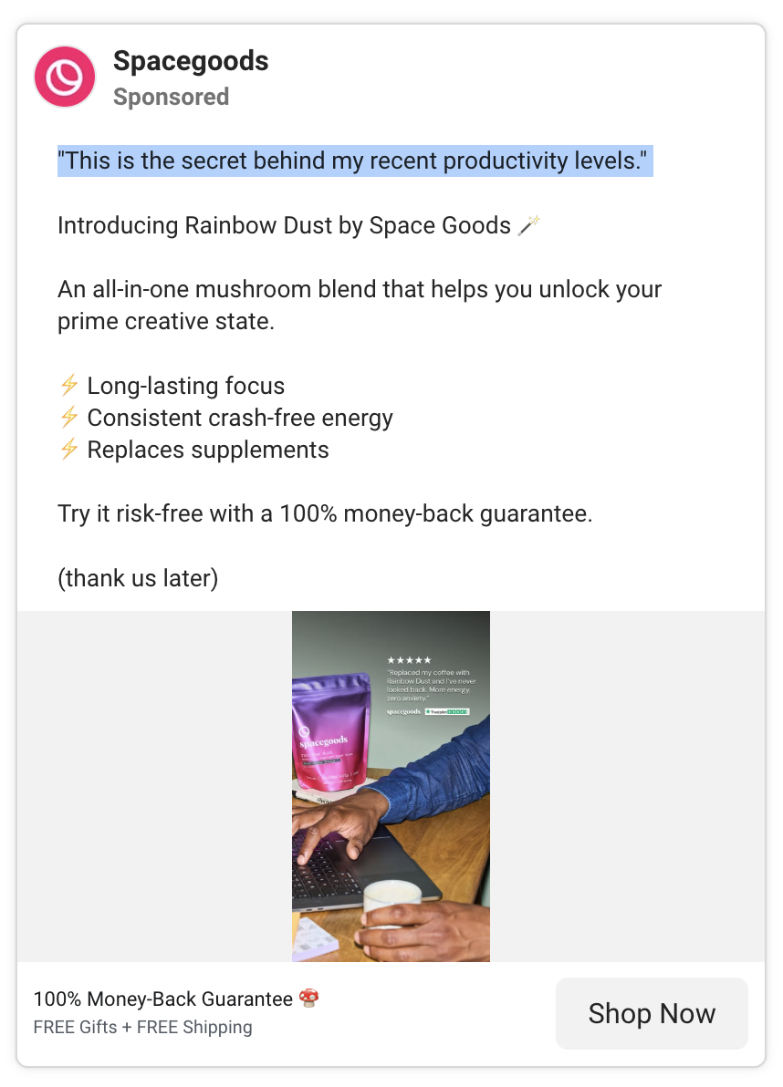
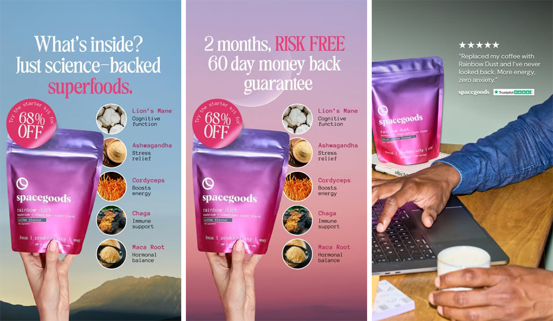
This one blends two high performing approaches: a lifestyle productivity shot and a Trustpilot style testimonial. It is built to speak directly to people looking for focus, energy, and a calmer alternative to caffeine.
Why this angle works:
- Instant social proof at the topFive stars plus a direct quote. No fluff. It reads like a real customer review and immediately positions the product as trusted. “Replaced my coffee” and “zero anxiety” both hit key pain points.
- Real world workspace contextThe hand on the laptop, the drink, the desk. It looks like a normal working day. This grounds the product in everyday use which makes the claim believable.
- Product placed naturallyThe pack is on the desk, not floating or overly staged. This anchors the idea that this fits seamlessly into your routine.
- Copy focused on functional outcomesThe expanded copy you shared hits the three core benefits with no wasted words. Long lasting focus. Crash free energy. Replaces supplements. These are immediate needs for knowledge workers.
- Creative state framing“Unlock your prime creative state” is a step above basic productivity language. It pushes it into a personal performance category which feels aspirational.
- Risk reversalA 100 percent money back guarantee removes hesitation. It is a smart addition for a functional product where people worry about whether it will work for them.
- Tone is confident but casualEnding with “thank us later” is a signature move. It adds personality without being loud.
What this creative teaches:
Productivity is one of the strongest emotional motivators in the wellness category. People want to feel focused, calm, and stable through the workday. Pairing a real review with a relatable workspace visual lowers skepticism and raises trust.
This angle is ideal for cold traffic looking for an alternative to coffee or for warm audiences comparing functional blends. It tells a simple story: this is what I use at my desk, it gives me better energy, and you can try it risk free.
The UGC Collab Angle
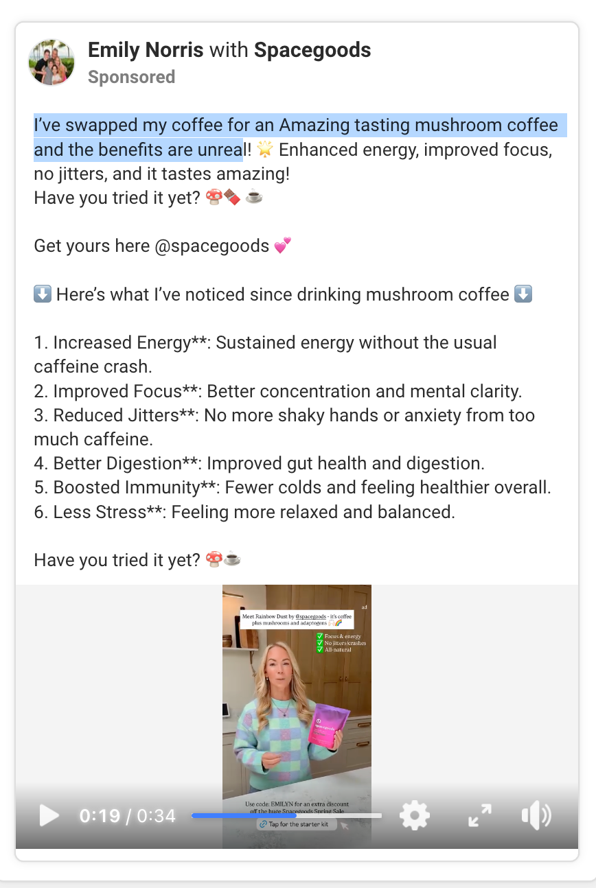
This is a classic creator partnership format. The brand steps back and lets a real person front the message. It makes the product feel socially validated instead of commercially pushed.
Why this angle works:
- Peer to peer framingThe opening line is written like a friend recommending something. “I’ve swapped my coffee” feels personal and believable. That tone is impossible for a brand account to recreate on its own.
- Creator familiarityUsing a creator with an existing audience adds built in trust. People recognise her, which means the message lands quicker and with less friction.
- Benefit heavy scriptThe creator lists benefits in a numbered format. Energy, focus, digestion, immunity, less stress. This is the science backed angle again, but delivered through a human voice rather than design.
- Natural kitchen settingFilmed in a home environment. It feels authentic, not studio produced. This makes the product seem like part of her daily routine.
- Two layers of credibilityThe post acts as both an ad and a testimonial. It reads like someone who has actually used the product and is reporting their experience.
- Dual call to actionThe caption encourages viewers to try it and the on screen text includes a discount code. This stacks motivation and urgency.
- Repetition of key selling pointsFocus and energy. No caffeine crash. No jitters. These points appear in the caption and the video. Repetition increases recall.
- Brand reputation by associationCollab posts signal that people are talking about the brand. It creates a sense of momentum. If someone sees multiple creators mentioning the product, it feels like a trend rather than an ad campaign.
What this creative teaches:
UGC collabs are one of the strongest ways to humanise a wellness brand. This style works because it looks like a genuine recommendation rather than a polished commercial. It tells viewers that real people are using the product, seeing benefits, and sharing it openly. Perfect for both cold traffic and warm audiences who need social proof before buying.
The Problem Split Angle
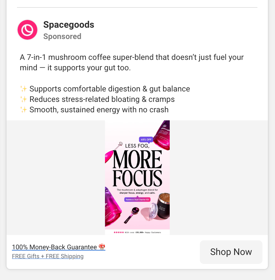
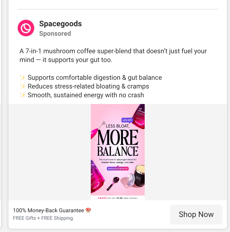
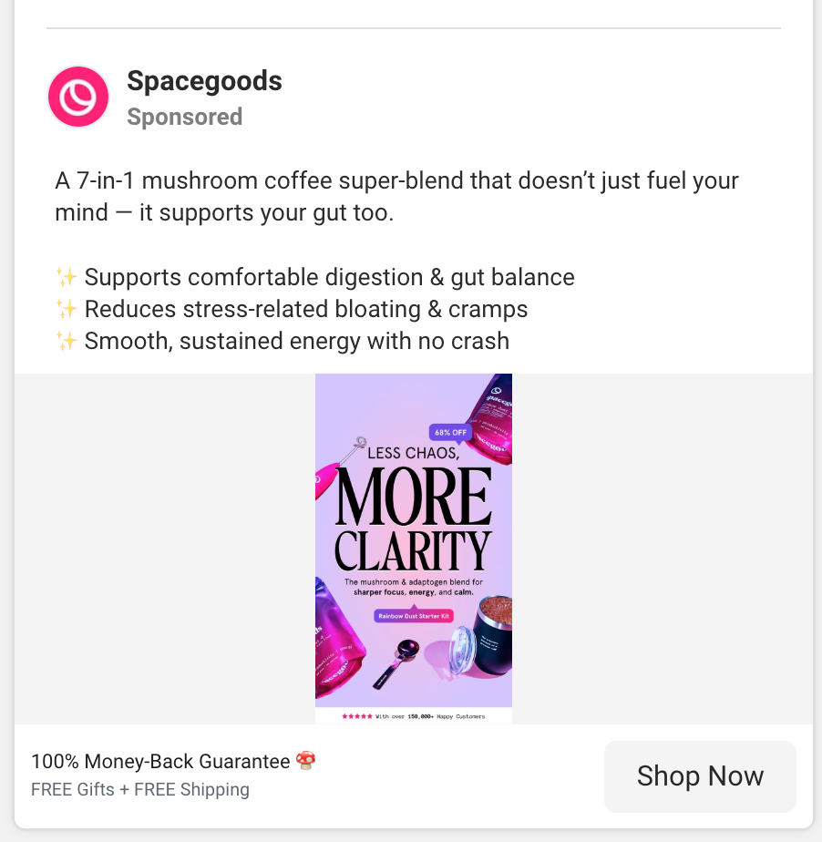
This set of ads shows Spacegoods running the same creative template three different ways, each one targeting a single core pain point. It is a clean way to widen reach without changing the product or the structure of the ad.
Here’s why this angle works:
- Each ad isolates one problemThree separate pain points, three separate emotional triggers. It allows Meta to match the right message to the right person.
- Less chaos, more clarity
- Less fog, more focus
- Less bloat, more balance
- Same structure, different outcomeEvery ad uses the same design format and headline pattern. This makes production fast but also lets them test which benefit resonates most. It is modular creative testing.
- Gut plus brain connectionThe caption always opens with a twist on typical mushroom coffee messaging. It frames the product as supporting both mind and gut. This adds depth to the claim and lets the benefits feel more holistic.
- Benefit bullets are identicalDigestion, reduced bloating, smooth energy. These three bullets stay constant. The only thing that changes is the headline in the image. This gives them consistency across the ad set and simplifies scaling.
- Clear visual hierarchyThe big benefit word is the focus word. Clarity. Focus. Balance. Simple, memorable, and emotional. One word carries the whole value story.
- Perfect for algorithmic learningRunning three versions lets the platform optimise for which users respond to which pain point. Some people click because of brain fog. Others click because of bloating. Others want work focus. Each version unlocks a different segment.
- Feels like different products without actually being differentThis is the clever part. One product solves multiple problems. Instead of saying “our product does everything,” they let each ad focus on one thing. It feels more believable and more targeted.
What this teaches:
When a single product has multiple benefits, the best strategy is often to split the message instead of merging benefits into one ad. These three creatives show how one template can become an entire performance ad set by changing a single word and a single pain point.
Perfect example of how to scale benefits testing while keeping creative costs low.
Potential new creative angles to scale performance
Spacegoods already run a wide mix of performance styles, from UGC to problem solving headlines to benefit heavy creative. What makes their ads strong is that they often isolate one emotional trigger per creative, instead of trying to sell everything at once. But there are still plenty of angles they could expand into that tap into behaviour patterns, identity framing, and specific pain points that go beyond their current library. Below is a list of high potential angles they could test next.
1. The Coffee Comparison Angle
They already hint at this, but they could go harder.
Side by side. Coffee vs Rainbow Dust.
Jitters vs calm. Crash vs smooth energy.
Black coffee visual vs bright Spacegoods pouch.
Super simple: a clean split graphic that makes switching feel obvious.
2. Morning Ritual Angle
Show the product as part of a slow, calming morning routine.
Warm kitchen shots. Poured into a mug.
Copy like:
“Start your morning without the chaos.”
“Your new ritual starts here.”
This taps into identity building, not just function.
3. Taste First Angle
Most mushroom coffees struggle with taste perception.
Spacegoods could lead with the idea that this one actually tastes good.
“Finally. A mushroom blend that tastes like something you want to drink.”
UGC reactions. Taste tests. First sip moments.
Taste advertising always wins in food and drink.
4. The Before and After Day Angle
Not images of people.
But a schedule.
Before: jittery, crashing, anxious.
After: calm energy, focus, steady mood.
A day in the life powered by Rainbow Dust.
A simple comic strip style layout could work.
5. The “It Replaces All This” Stack Removal Angle
Visual: a messy pile of capsules and supplements.
Next to it: one Spacegoods pouch.
Message: simplify your routine.
Minimal but powerful.
6. The Stress and Anxiety Relief Angle
More emotional and internal.
Copy about feeling steady, centered, calm.
Minimal visuals with soft colors.
Huge audience of people trying to manage stress.
7. The No Ingredients You Hate Angle
A “free from” angle.
No caffeine crash.
No jittery stimulants.
No filler supplements.
A simple clean label close up.
8. The Long Term Benefits Angle
A calendar visual.
Day 3: less jittery.
Day 7: more focus.
Day 14: smoother mornings.
Day 30: consistent energy.
This frames it as a habit with compounding returns.
9. The Gift Angle
(especially Black Friday, Christmas, peak Q4)
Mushroom coffee as the perfect wellness gift.
Great for friends who are into productivity, habits, or wellness.
Soft lifestyle gifting visuals. Very scalable.
10. The Challenge Angle
“Try it for 7 days.”
A simple challenge CTA to get people to try the starter kit.
Short term commitment. High conversion for supplements.
Perfect for UGC testimonials too.
11. The Crowd Reaction Angle
Combine Trustpilot reviews, creator clips, comments, screenshots.
A collage showing dozens of real reactions.
This builds the vibe that everyone is switching.
People love crowd momentum.
12. The “Fix Your Afternoon Crash” Angle
Morning is crowded.
Afternoon energy slump is less competitive.
Visual: clock at 3 pm.
Copy: “Your afternoon energy, fixed.”
This angle often scales because it hits a specific pain slot in the day.
13. The Minimalist Science Angle
White background.
Simple text.
Ingredient icons.
One benefit per ingredient.
It looks more clinical and builds credibility.
14. The Habit Replacement Angle
“Replace one coffee a day.”
“Replace your second coffee.”
“Replace your jittery caffeine habit.”
Small commitments convert extremely well.
15. The Sleep Friendly Angle
Big opportunity.
People who ditch caffeine sleep better.
“Stop the late day caffee, so you can actually sleep.”
There is a huge audience actively trying to fix sleep routines.
What makes Spacegoods so effective is not any single ad but the range of angles they explore. Each creative tests a different belief, pain point, or behavioural pattern, which lets the algorithm find the right match for the right person.
This is the real lesson. You do not need one perfect ad. You need a system of angles that all push the product forward from different directions. When done well, the result is a creative ecosystem that scales far beyond any individual piece of content.

